Published · 5 min read
QR Code Color Contrast Requirements: What Actually Scans
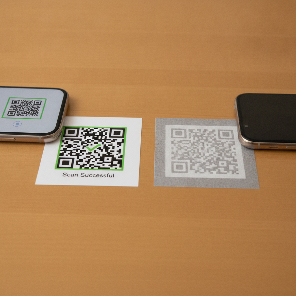
Contrast, not color, is what a scanner actually depends on. A QR code can be any color and still scan perfectly — or it can be styled in what looks like two similar, tasteful shades and fail completely. This is the setting most design decisions accidentally break, because it’s easy to check “does this look fine” on a bright monitor and never notice it wouldn’t survive being printed.
Why contrast matters more than color
A scanner reads a QR code by distinguishing dark modules from light background across the grid, then using the three corner finder patterns to establish orientation and scale. All of that depends on tonal difference, not hue. Two colors can be visually distinct to a human eye — a muted orange on a cream background, say — while being close enough in actual lightness that a camera struggles to separate them, especially under imperfect lighting or from a slight distance.
Standard black on white gives roughly 21:1 contrast and is the reason it remains the safest default. As a practical floor for anything else, aim for at least 3:1, and prefer 4:1 or higher if you can — the same threshold web accessibility guidelines use for text, for a related reason: both are about whether a reader (human or camera) can reliably distinguish foreground from background.
What actually breaks in the real world
Pastel-on-pastel styling. A soft blue code on a soft cream background might look like an intentional, on-brand choice on screen, and fail to scan reliably once printed, because the actual luminance difference is too small.
A code placed over a photograph or textured background. Even genuinely high-contrast module colors lose their advantage if the background behind them isn’t a flat, consistent tone — a scanner is trying to find a consistent boundary, and a busy image behind the code defeats that regardless of the module color itself.
Inverted codes — light modules on a dark background. Some scanners handle this correctly; enough don’t that it’s a real risk on anything printed. If you’re set on a dark theme, keep the modules themselves dark and put the dark color in the background around a lighter — but still sufficiently distinct — module color, rather than fully inverting.
Brand-color substitutions made without testing. The single most common way a previously-working code breaks is a rebrand or a template update that swaps black-on-white for a brand palette, without checking that the new colors still clear a safe contrast ratio once actually printed.
Testing contrast without guesswork
You don’t need specialized equipment to catch a contrast problem before it reaches print:
- Convert both colors to grayscale and compare. If the module color and background look close in brightness once color is removed, they’re too close for a scanner too — this is a rough approximation of what the camera’s decoder actually sees.
- Print a physical proof and view it under different lighting, not just your screen. Contrast that reads fine under bright monitor backlight can look considerably flatter under dim indoor lighting or bright outdoor glare.
- Test with more than one phone. Camera sensors and decoding software vary in how much contrast tolerance they have — a borderline color pairing might scan on a recent flagship and fail on an older or budget device.
Contrast becomes more important, not less, at larger sizes
It’s tempting to assume a bigger code has more margin for a subtler color choice. The opposite is usually true: large-format prints — posters, signage, banners — are more often viewed at an angle, from a greater distance, and under uncontrolled lighting (including direct sun), all of which reduce effective contrast further. See QR code size for flyers and posters for how sizing and contrast interact at that scale.
Contrast problems also compound with weak error correction — a code that’s already operating with reduced legibility from low contrast has less margin left to also recover from physical damage. See QR code error correction levels for how much protection each level actually buys you.
Quick reference
- Safest default: black modules on a white background (~21:1 contrast)
- Practical floor for any other pairing: 3:1, prefer 4:1 or higher
- Avoid: pastel-on-pastel, codes over photos or textures, and full color inversion
- Test: grayscale conversion, real print under real lighting, more than one phone
Generate a free, permanent QR code with safe, tested contrast — customizable colors, no account, no expiry. → Create yours with EtchedQR
For static vs dynamic, sizing, and every use case, see QR codes for print: the complete guide.