Published · 6 min read
QR Code Size for Flyers & Posters: A Distance-Based Guide
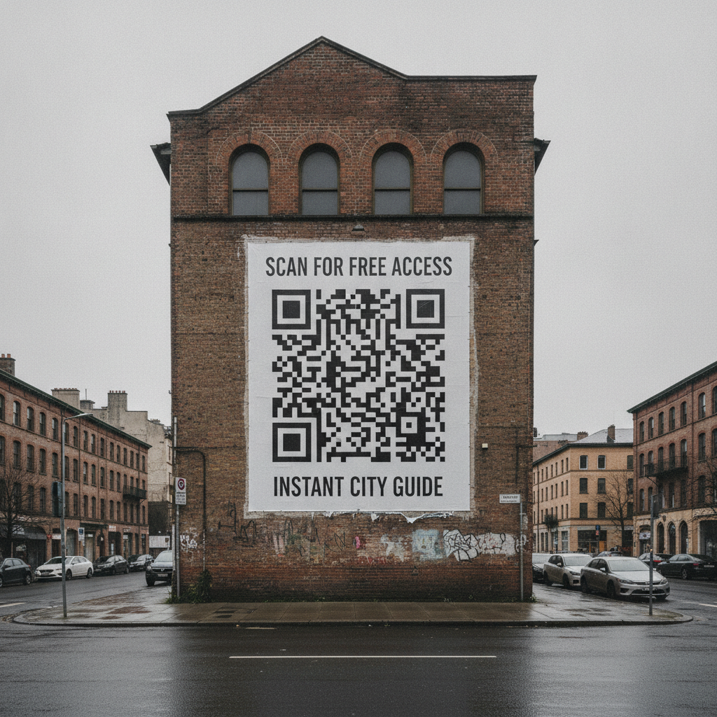
Flyers and posters get sized wrong more often than almost any other print format, for one specific reason: people size them for the paper, not for the distance they’ll actually be read from. A flyer handed directly to someone and a poster pinned to a noticeboard across a room are completely different sizing problems, even if the printed sheet is the same dimensions.
Size by actual viewing distance, not by paper size
The rule of thumb — minimum width equals scan distance divided by ten — matters more here than in almost any other use case, because “large format” doesn’t automatically mean “viewed from far away.” What matters is where the person actually stands when they’re close enough to consider scanning.
| Context | Realistic scan distance | Minimum size | Recommended |
|---|---|---|---|
| Flyer handed directly to someone | 20–30 cm | 3 × 3 cm | 3.5 × 3.5 cm |
| Flyer on a table or counter | 30–40 cm | 3 × 3 cm | 4 × 4 cm |
| Poster on a noticeboard, viewed up close | 40–60 cm | 5 × 5 cm | 6 × 6 cm |
| A3 poster on a wall | 1 m | 10 × 10 cm | 15 × 15 cm |
| Large poster or banner viewed across a room | 2–3 m | 20–30 cm | 25–40 cm |
These assume a short destination URL and good print quality. Add 20–25% if your link is long, the surface isn’t flat matte paper, or the poster will typically be viewed from further back than the table suggests — a poster mounted above eye level, for instance, is read from further away than one at eye level in the same room, because people naturally stand back to look up at it.
For the underlying math — module size, why size alone isn’t the real variable — see the general QR code size guide.
Contrast matters more as the format gets bigger
Small-format codes are usually printed in a controlled way: black ink on white paper, close reading distance, indoor lighting. Large-format prints introduce variables that make contrast failures far more common:
- Colored or branded backgrounds. A poster’s design often carries a brand color behind the code instead of plain white. If that background color is close in tone to the code’s foreground color, contrast drops below the safe threshold even if it looks fine on a monitor.
- Outdoor and variable lighting. A poster or flyer displayed outdoors is read under everything from bright midday sun to dusk, conditions a phone camera handles far less gracefully than a controlled indoor scan.
- Distance from the eye and from the code. People viewing a large poster from several meters away are also more likely to be viewing it at a slight angle, which further reduces effective contrast.
Keep dark modules on a light background wherever possible, and if the design calls for a colored background behind the code, test the actual contrast ratio rather than relying on how it looks on screen. This becomes especially important on large-format prints where the QR code often shares space with bold brand color — see color contrast requirements for the full breakdown of safe contrast combinations.
Placement on a poster or flyer
Avoid folds and edges. A flyer that gets folded for distribution can crease directly through the code, and a poster trimmed or mounted with an edge close to the code risks clipping the quiet zone during finishing.
Keep it away from the busiest part of the design. A code placed over a photograph or a textured background section fights for contrast it doesn’t need to fight for — a clean, plain-colored zone reserved specifically for the code is worth the layout compromise.
Print the destination as text nearby, larger than usual for this format. On a poster meant to be read from a few meters away, a scan failure is more costly than on a business card — there’s no second chance to hand someone a fixed copy. A short, legible URL underneath the code gives people a fallback that a business-card-sized code rarely needs as visibly.
Quick reference
- Size for the realistic scan distance, not the paper size: scan distance ÷ 10, then add 20–25% for large format.
- A3 poster at 1 m: 10 × 10 cm minimum, 15 × 15 cm recommended.
- Contrast: dark modules on a light, plain background — test actual contrast, don’t eyeball it on screen.
- Placement: away from folds, edges, and busy design elements; print the URL as legible backup text.
Generate a free, permanent QR code sized correctly for any format — SVG and high-res PNG, no account, no expiry. → Create yours with EtchedQR
For static vs dynamic, design, and every other use case, see QR codes for print: the complete guide.