Published · 9 min read
QR Code Size Guide for Print
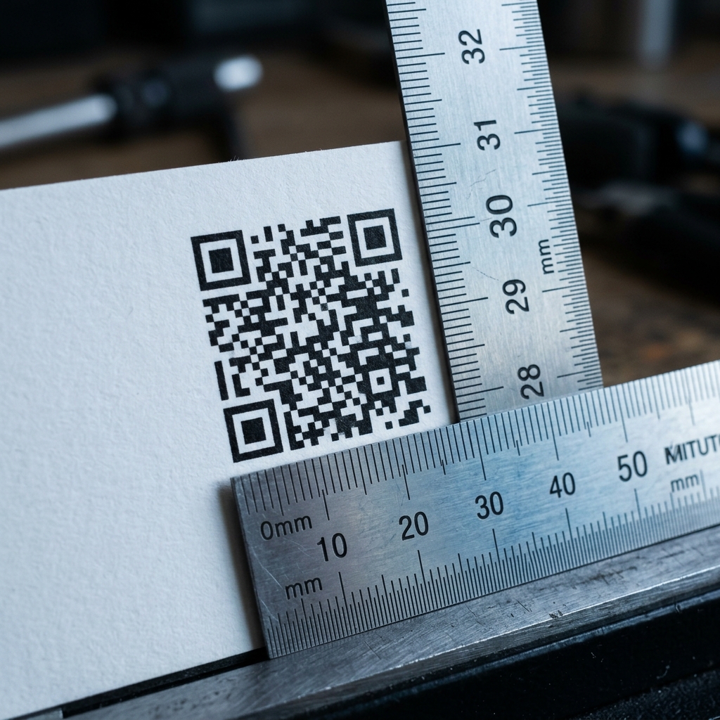
Interactive Scan Distance Calculator
The rule of thumb: minimum width = scan distance ÷ 10. A code read from 1 metre away needs to be at least 10 cm wide. From 20 cm — a menu or card in someone’s hand — 2 cm.
That’s the answer most guides stop at. It’s a good starting point and it’s wrong often enough to ruin a print run, because size isn’t really the variable. Module size is. Once you understand modules, you can size any code for any surface without a lookup table, and you’ll spot the failures a table can’t predict.
Modules: the number that actually matters
A QR code is a square grid of small squares. Each small square is a module. The smallest possible grid is Version 1 at 21 × 21 modules; the grid grows in steps of 4 as you encode more data — 25 × 25, 29 × 29, and upward.
Your printed code’s reliability depends on how physically large one module is:
module size = code width ÷ modules per side
A 2 cm code at Version 1 gives modules of roughly 0.95 mm — comfortable. Encode a long URL, push it to Version 6 (41 × 41), keep the same 2 cm, and each module drops to about 0.49 mm. Same size on the page. Half the module. Meaningfully harder to scan.
Practical floors for module size:
| Printing method | Safe minimum module |
|---|---|
| Offset / commercial litho, coated stock | 0.4 mm |
| Digital press, coated stock | 0.4 mm |
| Uncoated or textured stock | 0.5 mm |
| Thermal labels | 0.5 mm |
| Flexo on corrugated | 0.6 mm |
| Laser marking / etching on metal | 0.3 mm |
| Screen printing on fabric | 0.8 mm |
Guidance around the format cites 0.25 mm as a theoretical minimum. Treat that as a laboratory figure. Presses spread ink, stock absorbs it, and registration drifts; 0.4 mm is where real jobs stop failing.
This is why shortening your URL is a sizing decision, not a tidiness preference. Fewer characters means a lower version, fewer modules, and larger modules at the same printed size. Encoding yoursite.com/m instead of yoursite.com/menus/spring-2026/index.html?utm_source=table-tent can be the difference between a code that scans first time and one that needs three attempts in bad light.
Size by use case
Sizes assume a short URL (Version 1–3) and good print quality. Add 20% if your URL is long, the stock is uncoated, or lighting will be poor.
| Where it’s printed | Scan distance | Minimum | Recommended |
|---|---|---|---|
| Business card | 15 cm | 2 × 2 cm | 2.5 × 2.5 cm |
| Product label, small box | 20 cm | 2 × 2 cm | 2.5 × 2.5 cm |
| Menu, flyer, brochure | 30 cm | 3 × 3 cm | 3.5 × 3.5 cm |
| Table tent, counter card | 40 cm | 4 × 4 cm | 5 × 5 cm |
| Poster (A3), wall notice | 1 m | 10 × 10 cm | 15 × 15 cm |
| A-frame, pull-up banner | 2 m | 20 × 20 cm | 25 × 25 cm |
| Shop window | 3 m | 30 × 30 cm | 40 × 40 cm |
| Vehicle livery | 5 m | 50 × 50 cm | 60 × 60 cm |
| Billboard | 20 m | 2 × 2 m | 2.5 × 2.5 m |
Two adjustments worth making by judgement rather than table:
Scan distance is where people actually stand, not where the code is. A code at the top of a 2-metre banner is read from further away than one at eye level on the same banner. A window decal is scanned from the pavement, not from the glass.
Moving audiences need more. People walking past, or in a car, get one attempt at focus. Size up a tier.
The quiet zone: the failure nobody designs for
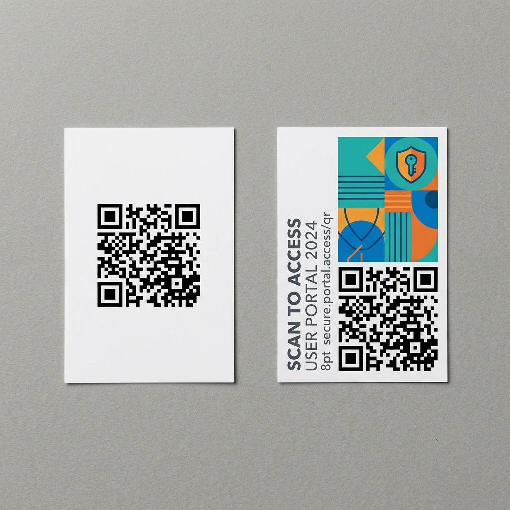
Every QR code needs a clear margin around it. The ISO/IEC 18004 standard requires at least 4 modules of blank space on all four sides (Micro QR needs 2). Without it, scanners can’t find the code’s boundary — the finder patterns in the corners only work if the scanner can tell where the grid stops.
Because it’s specified in modules, the margin scales with the code:
- 2 cm code, Version 1 → modules ≈ 0.95 mm → quiet zone ≈ 3.8 mm per side
- 5 cm code, Version 1 → modules ≈ 2.38 mm → quiet zone ≈ 9.5 mm per side
Same code, same rule, very different physical margin. As a rough shortcut: leave clear space equal to about 10–15% of the code’s width.
Three things that quietly eat the quiet zone:
- Tight layouts. A designer fitting a code into a corner trims the margin because it looks like empty space. It isn’t — it’s part of the code.
- Coloured panels and background images. The margin has to be clear and contrast with the modules. A code sitting on a dark photograph has no functional quiet zone even if there’s a gap.
- Die lines and folds. A code near a crease, perforation, or trimmed edge can lose its margin at the finishing stage, after the proof looked fine.
Measure the margin against the nearest printed element, not the edge of the page.
DPI and file format
Resolution needs scale inversely with viewing distance, which surprises people:
| Application | Resolution |
|---|---|
| Business cards, labels, packaging | 300 DPI minimum |
| Menus, flyers, brochures | 300 DPI |
| Posters, signage | 150 DPI is sufficient |
| Billboards, building wraps | 72 DPI or less |
Use vector wherever it’s accepted. SVG, EPS, or PDF are resolution-independent: the same file works on a business card and a billboard, and your printer can scale it without you regenerating anything. A QR code is pure geometry — flat squares with hard edges — which is exactly what vector formats exist for.
If you must use raster, use PNG. Never JPEG. JPEG compression introduces soft halos at high-contrast edges, which is the precise thing a scanner is trying to measure. The artefacts may be invisible to you at 100% and still cost you decode reliability at 2 cm.
Error correction: pick it for the environment
QR codes carry redundant data so a damaged code still decodes. Four levels:
| Level | Recoverable damage | Use for |
|---|---|---|
| L | ~7% | Screens, controlled digital use |
| M | ~15% | Clean indoor print — menus, cards, brochures |
| Q | ~25% | Packaging, labels, laminated items, anything handled |
| H | ~30% | Outdoor signage, industrial labels, codes with a logo overlay |
The trade-off: higher error correction means more modules for the same data. Jumping from M to H can push the version up and shrink your modules at a fixed printed size. If you need H and you’re tight on space, shorten the URL to buy the modules back.
If you’re placing a logo in the centre, use level H, keep the overlay under about 20–25% of the code’s area, leave a small clear margin around the logo, and never cover the three corner finder patterns. Above roughly 30% coverage, decode failures start regardless of level.
Surface changes everything
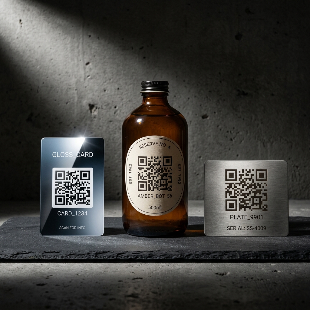
Every sizing table silently assumes flat matte paper. Most real jobs aren’t.
Glossy and varnished stock reflects the phone’s own light back into the lens. Specular highlights wash out whole regions of the grid. Size up 20%, and if you have the option, request a matte varnish over the code area only.
Curved surfaces — bottles, cans, tubes, jars — distort the module grid. The steeper the curve relative to the code’s width, the worse. Keep the code narrow relative to the diameter, orient it so the curve runs vertically through the code rather than horizontally across it, and size up 25%.
Metal, whether laser-marked or etched, gives you fine modules but poor contrast — you’re relying on surface texture rather than tonal difference. Level H, and test under the lighting the code will actually live in.
Uncoated and textured stock absorbs ink, so modules spread and gaps close. This is dot gain, and it’s the reason a code that passed on a proof fails on the run. Size up 20% and hold modules at 0.5 mm or above.
Fabric is the hardest. Weave defines your practical module floor, ink migrates along fibres, and the surface moves. Go large, level H, and prototype on the actual material.
Test properly before the run
Screen-testing tells you almost nothing. A retina display at 30 cm is a far easier read than uncoated card under fluorescent tubes.
- Print at final size on the final stock. Not the office laser printer, not a scaled proof. The real substrate.
- Test on at least three phones, including an old one. Recent flagship cameras rescue marginal codes that a four-year-old mid-range phone rejects outright. Your test device is rarely the worst one in your audience’s pocket.
- Test in the real environment. Real lighting, real distance, real angle. A menu is read at 45° in dim light, not square-on at a desk.
- Test at an angle and off-centre. Nobody frames a code perfectly.
- Note your smallest successful size, then add 20%. That margin absorbs press variation and the scanning conditions you didn’t anticipate.
- Always print the URL as text nearby. Small, unobtrusive, next to the code. When a scan fails, this is the only thing standing between your customer and giving up. It costs a line of type.
Common reasons printed codes fail
In roughly the order I’d check them:
- Quiet zone cropped or compromised by a background
- Modules below the practical floor for the printing method
- Long URL forcing a high version at a fixed size
- Low contrast — mid-tone code on a mid-tone background
- Inverted code — light modules on a dark background. Some scanners handle it; enough don’t that it isn’t worth the risk on print. Dark on light, always.
- Rounded or stylised module shapes eroding the effective module edge
- Logo overlay too large, or at the wrong error correction level
- JPEG compression artefacts
- Glossy varnish reflecting under the intended lighting
- Code placed across a fold, crease, or die line
Quick reference
- Size: scan distance ÷ 10
- Never below: 2 × 2 cm for print
- Module floor: 0.4 mm (0.5 mm on uncoated)
- Quiet zone: 4 modules, or ~10–15% of code width
- Resolution: 300 DPI close-range, vector wherever possible
- Error correction: M indoors, Q for handled items, H for outdoors and logos
- Contrast: dark on light, minimum 3:1, aim for 4:1 or better
- Always: print the URL as text beside the code
Generate a print-ready QR code free — SVG and 300 DPI transparent PNG, no account, no expiry. → EtchedQR
For the two tightest common formats, see the dedicated guides: QR code size for a business card and QR code size for flyers and posters.
For static vs dynamic, design, and use-case-specific advice beyond sizing, see QR codes for print: the complete guide.
A note on terminology: QR Code is a registered trademark of Denso Wave Incorporated, which developed the format and publishes it as the open ISO/IEC 18004 standard. Sizing and quiet-zone requirements referenced here follow that specification.