Published · 6 min read
Custom QR Code Design: Patterns, Colors, Corner Styles (and Where Logos Fit)
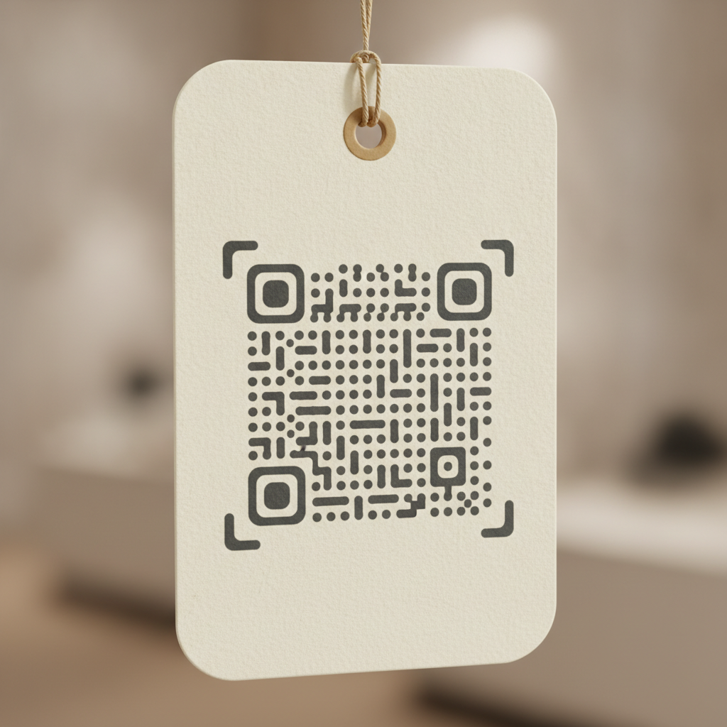
A QR code doesn’t have to look like a stark black-and-white grid to scan reliably. Pattern shape, corner styling, and color are all genuinely safe to customize — the scanner cares about structure and contrast, not aesthetics. What isn’t safe is guessing at which changes are cosmetic and which ones quietly damage the parts of the code a scanner actually depends on.
What’s safe to customize
Module pattern shape. The square modules that make up the grid can be rendered as rounded squares, dots, or other softened shapes without affecting scan reliability, as long as each module stays clearly separated from its neighbors at the size you’re printing. EtchedQR’s generator offers four pattern styles — Square, Round, Dots, and Diamond — all built to preserve that separation at the module level.
Corner-eye style. The three large squares in the code’s corners (the finder patterns a scanner uses first to locate and orient the grid) can be softened from sharp squares into rounded corners or full circles. This is a purely cosmetic change to the finder patterns’ outer shape — the scanner is detecting the nested light-dark-light structure, not the exact corner radius. EtchedQR offers Square, Rounded, and Circle corner-eye styles.
Ink and background color, including transparency. As covered in full in color contrast requirements, color itself isn’t the constraint — tonal contrast is. A dark, high-contrast ink color on a light background (or a transparent background dropped onto a light surface) scans exactly as reliably as plain black on white, and EtchedQR’s tool lets you set both independently, including a transparent-background export for dropping the code onto existing artwork.
Export size and format. Scaling up to a larger export, or switching between PNG and SVG, changes nothing about scan reliability on its own — see the general size guide for how size interacts with your actual print distance.
What actually breaks a code
Over-rounding until modules merge. Pushed too far, a heavily rounded or dot-based pattern can cause adjacent modules to visually blend at small print sizes, effectively erasing the fine detail a scanner needs. This is a size interaction as much as a style one — a style that reads fine at 5 cm might blur together at 2 cm.
Touching the finder patterns’ internal structure. The corner eyes can be softened in outer shape, but the nested square-within-square structure inside each one has to stay intact and high-contrast. A design that decoratively fills or breaks up that inner structure — rather than just rounding its outer edge — risks the scanner failing to lock onto the code at all.
Low contrast introduced by “on-brand” color choices. Covered in depth in the contrast guide linked above — this is the single most common way a styled code fails compared to a plain black-and-white one.
Background images or busy artwork directly behind the code. A transparent export is meant for dropping onto a clean, sufficiently contrasting area of existing artwork — not directly onto a photograph or a busy pattern, which reintroduces the same contrast and quiet-zone problems covered in the sizing and contrast guides.
Where logos fit in
This is worth being direct about: EtchedQR’s generator doesn’t currently support embedding a logo in the code. The tool covers pattern shape, corner-eye style, ink and paper color, and error correction — genuinely useful styling that covers most of what makes a QR code feel designed rather than default — but logo embedding specifically isn’t one of its controls today.
If your project calls for a centered logo, the general rules for doing it safely, regardless of which tool generates the base code, are:
- Use the highest error correction level, H (~30% recoverable damage). A logo covers real data-bearing modules; H gives the decoder enough redundancy to reconstruct what’s hidden underneath. See error correction levels explained for the full trade-off.
- Keep the logo to roughly 20-25% of the code’s total area. Beyond about 30% coverage, decode failures become common regardless of error correction level.
- Leave a small clear margin around the logo itself, rather than letting it touch the surrounding modules directly.
- Never cover any of the three corner finder patterns. These are what the scanner uses to locate the grid in the first place — covering one is a much more severe failure than covering an equivalent area of ordinary data modules.
Generate the base code at level H in EtchedQR, export the high-resolution PNG or SVG, and add the logo at the design or print-production stage, applying the constraints above. It’s an extra step rather than a single-tool workflow today, but it produces a reliably scannable result.
Quick reference
- Safe to customize: module pattern (Square, Round, Dots, Diamond), corner-eye style (Square, Rounded, Circle), ink/background color, transparency, export size and format
- Not currently supported: logo embedding — generate at level H and add a logo separately if you need one
- Avoid: over-rounding until modules merge, touching the finder patterns’ inner structure, low-contrast color pairings, busy backgrounds behind a transparent export
Customize pattern, corner style, and color on a free, permanent QR code — no account, no expiry. → Create yours with EtchedQR
For static vs dynamic, sizing, and every use case, see QR codes for print: the complete guide.